Meliora Mirror: Designing an Interface for Ambient Computing
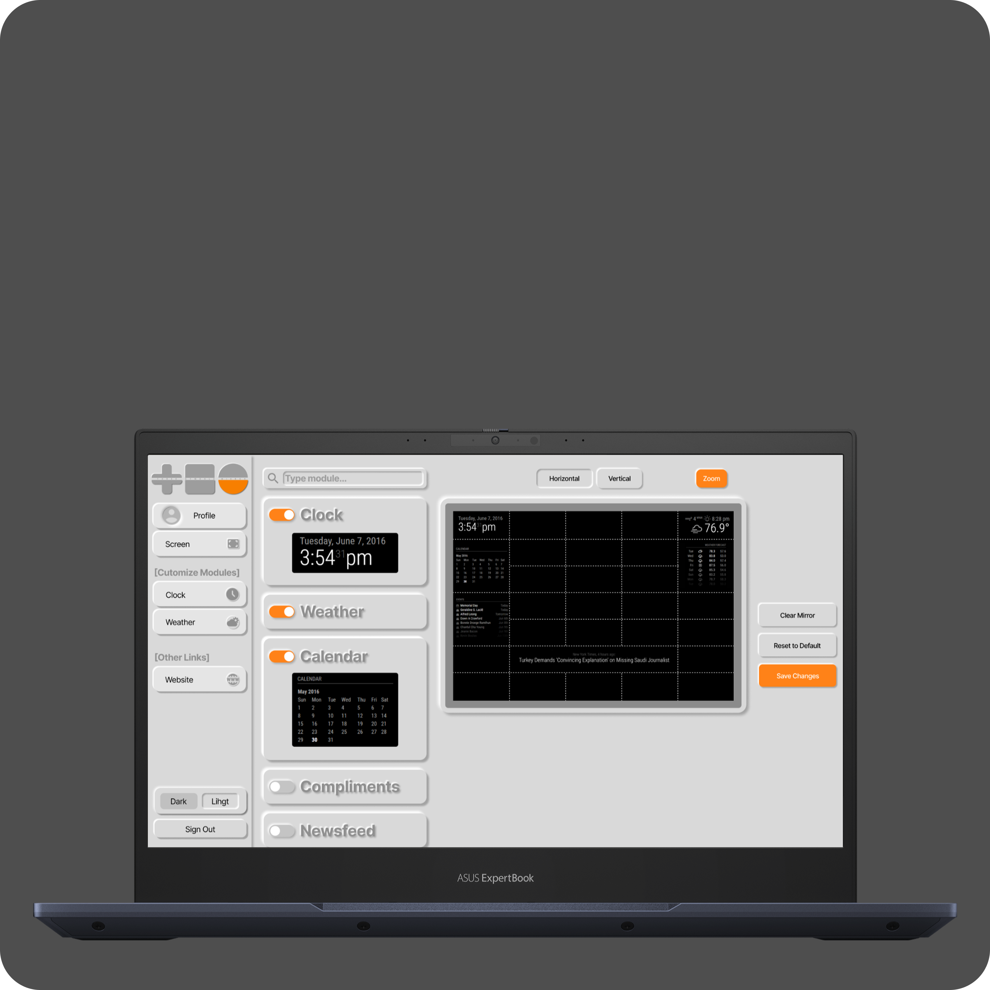
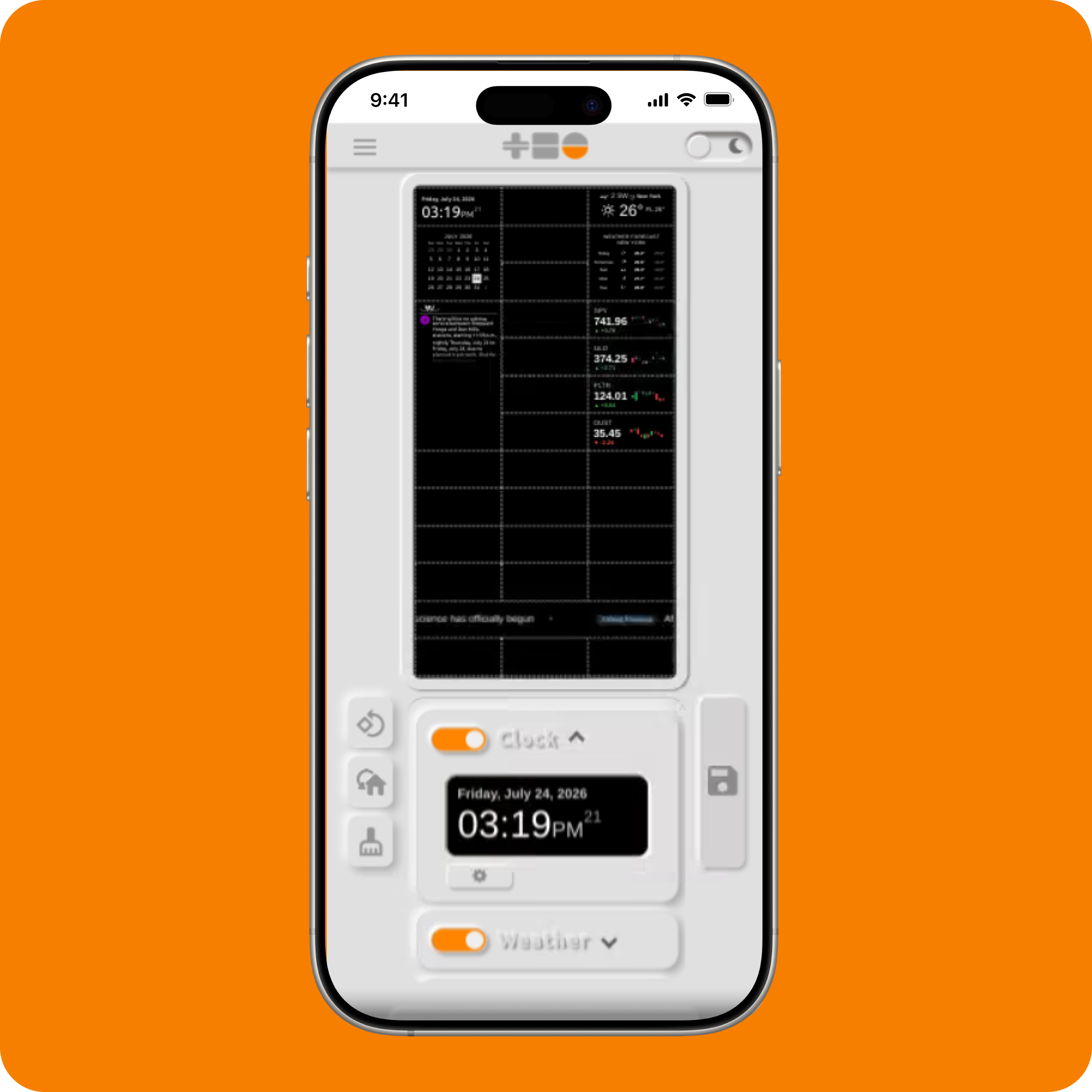
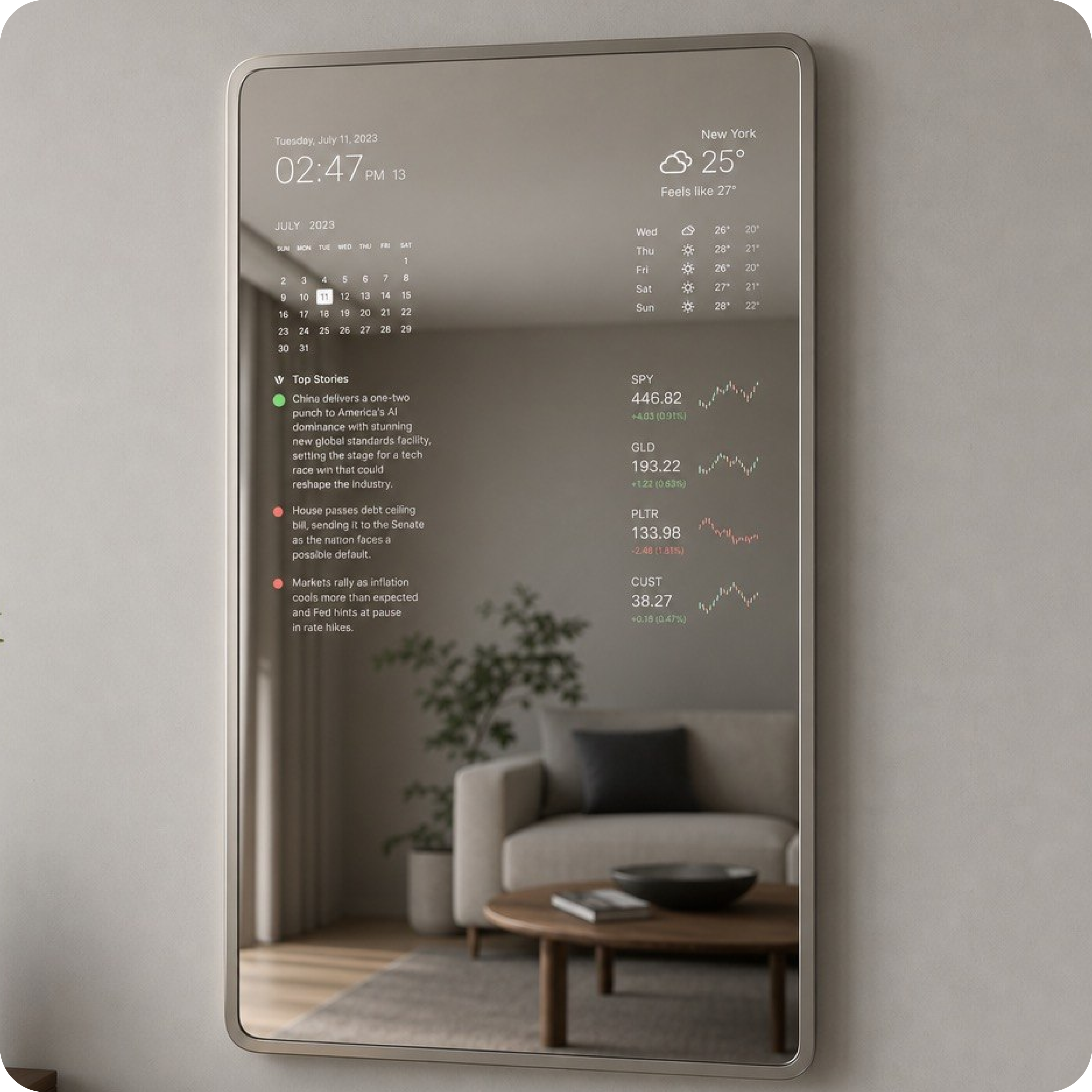
Figure 1. The Meliora Mirror interface — desktop, mobile, and hardware concept.
Part 1 — Introduction
Designing Beyond the Screen
Meliora Mirror began with a simple question:
What if technology could quietly exist within everyday environments instead of constantly demanding attention?
Rather than designing another application to compete for screen time, I wanted to explore how digital information could naturally blend into physical spaces. A mirror already plays an important role in daily routines. Instead of becoming another device to interact with, I envisioned it as an ambient display that surfaces useful information exactly when needed.
This project explores how interface design changes when the objective is not maximizing engagement, but reducing friction.
Meliora Mirror is currently a software prototype and design system — built and running as a live interface, designed around a two-way-mirror hardware concept that hasn’t been physically built yet. That target device shaped every decision below, from contrast ratios to layout, even ahead of the physical build.
Project Goals
The primary design goals were:
- Create an interface that remains visually calm and uncluttered.
- Present information in a way that can be understood within seconds.
- Build a modular layout that users can personalize.
- Design a system that can grow without becoming visually overwhelming.
- Establish a design foundation for future conversational, AI-driven interaction.
Part 2 — Understanding the User Experience
Unlike traditional applications, Meliora Mirror isn’t intended to replace phones or computers.
Instead, it complements them.
The interface focuses on information users frequently check throughout the day, including:
- Current weather
- Calendar events
- News headlines
- Transit information
- Stock prices
- Time and date
Rather than requiring navigation between multiple screens, these services exist together within a single glanceable interface.

Figure 2. Overall dashboard organization.
Part 3 — Designing Around a Hardware Concept
Even without a physical build yet, the interface wasn’t designed against a generic screen — it was designed against a specific target: a display mounted behind two-way mirror glass, viewed from a few feet away, with no touch, mouse, or remote.
That concept sets real constraints ahead of the hardware existing:
- No input device. Everything has to be understood at a glance, not navigated to.
- Reduced effective contrast. Two-way glass darkens and slightly reflects whatever’s behind it, which pushes minimum type size and contrast ratios higher than a normal screen would need.
- Distance viewing. Content is read from feet away, not inches — which ruled out dense layouts early on, regardless of how they tested on a laptop screen.
Designing for this concept first, rather than treating it as a future consideration, is why contrast, spacing, and type size decisions throughout this system are more conservative than a typical dashboard.
Part 4 — Design Philosophy
Several principles guided every design decision throughout the project.
Simplicity
Each screen should communicate information without unnecessary visual complexity.
Removing distractions became just as important as adding functionality.
Information Hierarchy
Not every piece of information deserves equal attention.
Important information should naturally stand out through size, spacing, and positioning instead of relying on excessive color or decoration.
Consistency
Every widget follows consistent spacing, typography, padding, and interaction patterns.
Consistency reduces cognitive load while making future features easier to integrate.
Modularity
Every feature was designed as an independent visual module.
Rather than redesigning the interface whenever new functionality is introduced, additional widgets can integrate into an existing visual language.
Part 5 — Designing the Interface
Early layouts attempted to display too much information simultaneously — weather, calendar, transit, and news all competing for attention at once. Testing that against the “glance, don’t read” constraint from Part 3 made the problem obvious: nothing was actually readable at a glance, because everything competed for it.
As the design matured, greater emphasis was placed on visual hierarchy, spacing, and grouping related information together. Rather than designing individual screens, the focus shifted to a flexible system capable of adapting as the platform grows.

Figure 3. Early layout exploration.
Part 6 — Designing for Customization
One of the project’s primary goals was allowing users to personalize their experience.
Instead of forcing every user into the same dashboard, Meliora Mirror introduces customization through modular widgets. Users enable or disable information panels — Clock, Weather, Calendar, Compliments, and more — through a live editor that mirrors the actual layout, so toggling a module updates the preview directly rather than requiring a separate settings screen disconnected from the result.
Customization became a core part of the user experience rather than an afterthought.

Figure 4. Live module editor — toggling widgets updates the interface preview directly.
Part 7 — Design System
To maintain consistency across the application, a full token-based design system was built rather than styling each screen individually.
Color
A small primary/neutral token set spans both dark and light themes, with a single accent color reserved for actions and highlights. Every core text/background pairing was checked against WCAG 2.1 contrast requirements rather than assumed — the darkest-on-lightest pairing reaches 7.2:1, exceeding AAA for large text and UI.

Figure 5. Color tokens and WCAG 2.1 contrast compliance across the dark theme.
Typography
Inter was chosen for clarity at both extremes of the hierarchy — large enough at display size to register at a glance, and legible even at the smallest label sizes. A defined weight ladder keeps usage restrained: Semibold for headers, Regular for body copy, Bold reserved for moments that need real emphasis.

Figure 6. Type hierarchy from display through label, with real usage examples.
Layout & Grid
A 3-column, 72px row-unit grid runs underneath every screen, with a consistent 24px outer margin and 8px gutters — applied the same way across vertical, horizontal, and mobile orientations. Modules snap to column and row boundaries, so placement stays predictable no matter how many widgets a user has enabled.

Figure 7. Grid system applied across vertical, horizontal, and spacing token scale.
Component Library
Every interface element — navigation, inputs, controls, buttons, module cards, icons, and feedback states — was built once as a reusable pattern. Interactive states (default, hover, pressed, focus, disabled) are defined systematically, so new widgets inherit correct behavior automatically instead of needing a one-off interaction spec.

Figure 8. Reusable components with defined interaction states.
Part 8 — Proof of Concept
The system isn’t only a set of design files — it runs live, in-browser, as working software.

Figure 9. The live module editor, running in-browser on mobile.
This matters because it’s the point where the design system stopped being theoretical: spacing, contrast, and component states had to hold up in a real browser, not just in a design file.
Part 9 — Responsive Design
Meliora Mirror is designed to support multiple display sizes and orientations, since the eventual hardware target and the software’s current reality (browser, mobile) are different form factors that both need to work.
Layouts were explored for:
- Portrait orientation (the intended mirror target)
- Landscape orientation
- Mobile, for the current in-browser prototype
The same grid and token system underlies all three, so the layout logic doesn’t need to be relearned between the eventual physical target and the software that exists today.

Figure 10. Interface variations across orientation and device.
Part 10 — Iteration
One of the biggest lessons from this project was the importance of continuous iteration.
As the interface evolved, multiple sections were redesigned, including:
- Sidebar navigation
- Widget manager
- Settings screens
- Dashboard layouts
- Preview system
- Component spacing
- Visual hierarchy
Each revision improved usability while reinforcing consistency across the platform.
Part 11 — Lessons Learned
Designing Meliora Mirror reinforced several principles that continue to influence my work.
- Good interfaces prioritize clarity over complexity.
- Modularity makes products easier to expand.
- Design systems create consistency across growing applications.
- Small visual refinements often have a larger impact than major redesigns.
- Great user experiences evolve through continuous iteration rather than a single design phase.
One honest gap: the design system was built and refined largely in isolation, ahead of the physical hardware and outside feedback beyond my own use. It’s consistent and built to extend cleanly, but the next real test is putting it in front of someone else — and eventually, the actual device it was designed for.
Part 12 — Looking Forward
Meliora Mirror continues to evolve as a concept and a platform.
Future exploration includes:
- Voice-first, conversational AI interaction
- Context-aware interfaces that adapt to time and environment
- Personalized, multi-user dashboards
- The physical hardware build the current system was designed around
The current interface establishes a foundation that can support these future directions while remaining focused on clarity, simplicity, and thoughtful interaction design.